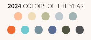
Leveraging the Pantone Color of the Year for Spring Collections

As the blossoms start to bloom and the fashion world gears up for the unveiling of spring collections, there’s one key element that shouldn’t be overlooked: the Pantone Color of the Year. For emerging fashion designers looking to make a mark and boost sales, understanding the significance of this annual color proclamation is crucial. In this blog post, we’ll delve into how integrating the Pantone Color of the Year into spring lines can elevate designs, capture consumer interest, and ultimately impact sales.
Understanding the Pantone Color of the Year:
For those navigating the competitive realm of fashion design, the Pantone Color of the Year is not just a trendy shade; it’s a strategic tool. This annually selected hue encapsulates the spirit of the times, reflecting cultural shifts, emotions, and societal movements. As you embark on crafting your spring collection, embracing this color is more than a creative choice—it’s a savvy business move.
The Impact on Consumer Appeal:
- Trend Relevance:
Incorporating the Pantone Color of the Year signals to consumers that your designs are not only visually appealing but also on-trend. This relevance is crucial for attracting a consumer base that values staying ahead in the world of fashion. - Emotional Connection:
Colors evoke emotions, and the Pantone Color of the Year is chosen with this in mind. Aligning your spring collection with this carefully selected hue enables you to forge a deeper emotional connection with your audience. It’s a way of saying, “I understand what resonates with you right now.”
Strategies for Integration:
- Showcase in Key Pieces:
Kick off your spring line with a bang by incorporating the Pantone Color of the Year into key statement pieces. Whether it’s a vibrant dress, a tailored suit, or a must-have accessory, these focal points not only highlight your design skills but also draw attention to the trending color. - Strategic Placement:
For a more subtle approach, strategically place the color in accessories or specific parts of your garments. Think cuffs, collars, or even subtle stitching details. This allows you to integrate the trend without overshadowing your overall design aesthetic. - Prints and Patterns:
Experiment with prints and patterns that seamlessly weave in the Pantone Color of the Year. This approach adds dynamism to your collection and positions your brand as one that embraces both innovation and current trends.
Boosting Sales:
- Consumer Anticipation:
The announcement of the Pantone Color of the Year generates buzz and anticipation. By aligning your collection with this color, you tap into the excitement surrounding the trend, creating a sense of urgency and anticipation that can positively impact sales. - Marketing Advantage:
Utilize the Pantone Color of the Year as a marketing tool. Highlight its presence in your collection through social media teasers, email campaigns, and promotional materials. This not only boosts visibility but also positions your brand as one that stays attuned to industry trends. - Consumer Confidence:
When consumers see that your designs align with the Pantone Color of the Year, it instills confidence in your brand. It communicates that you are not only aware of current trends but are actively incorporating them into your creations, making your pieces more desirable.
For emerging fashion designers gearing up for their spring collections, the Pantone Color of the Year isn’t just a shade—it’s a strategic advantage. By understanding its significance, creatively integrating it into designs, and leveraging it in marketing efforts, you can elevate your brand, capture consumer interest, and ultimately boost sales. As you embark on this journey, remember that the Pantone Color of the Year isn’t just a trend; it’s a pathway to success in the competitive world of fashion design.

